YUZU*
Public relations agency
Branding guidelines
Toulouse, 2022
Public relations agency
Branding guidelines
Toulouse, 2022
1) About the project
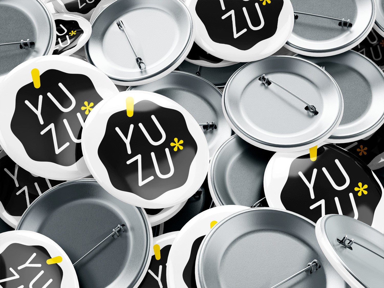
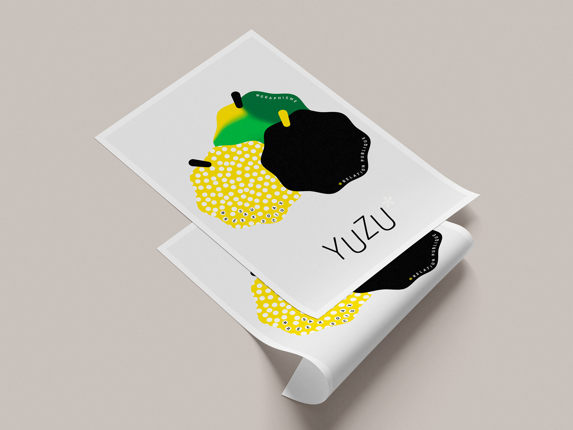
YUZU Communication is a public relations agency specializing in culture and entertainment based in Toulouse, France. I was asked to design a logo and develop a conceptual approach for its branding. I chose to center the identity around the yuzu itself—a citrus fruit from Japan.
2) My approach
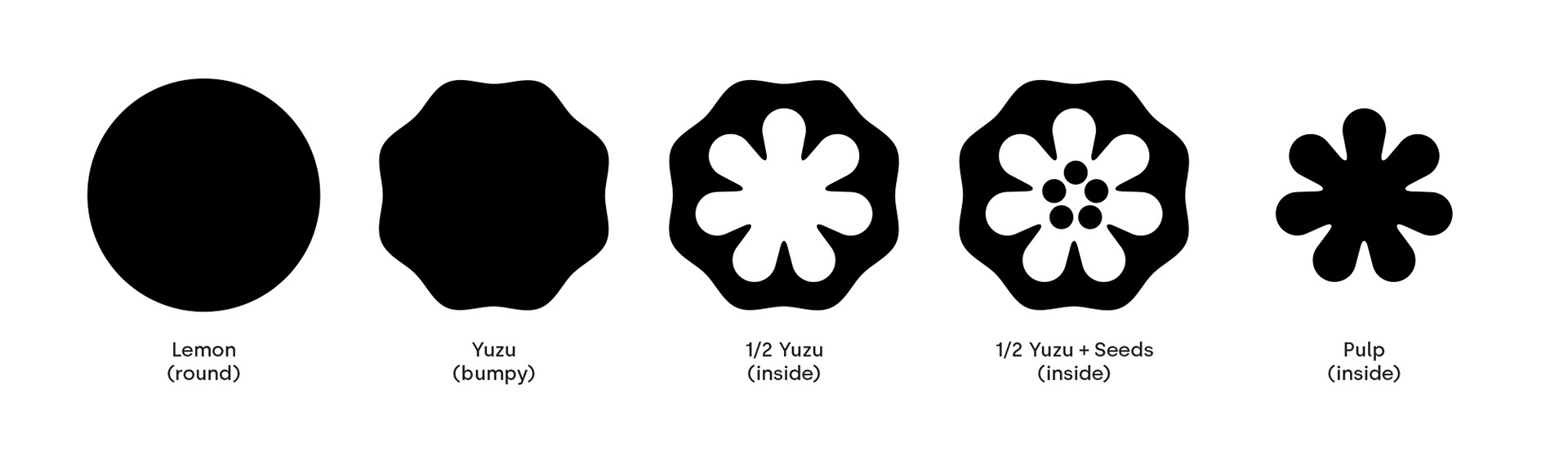
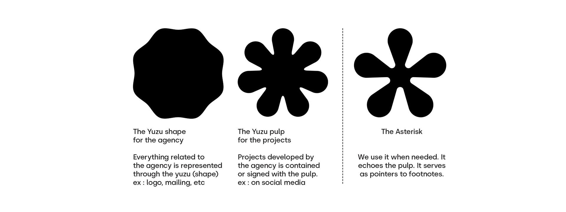
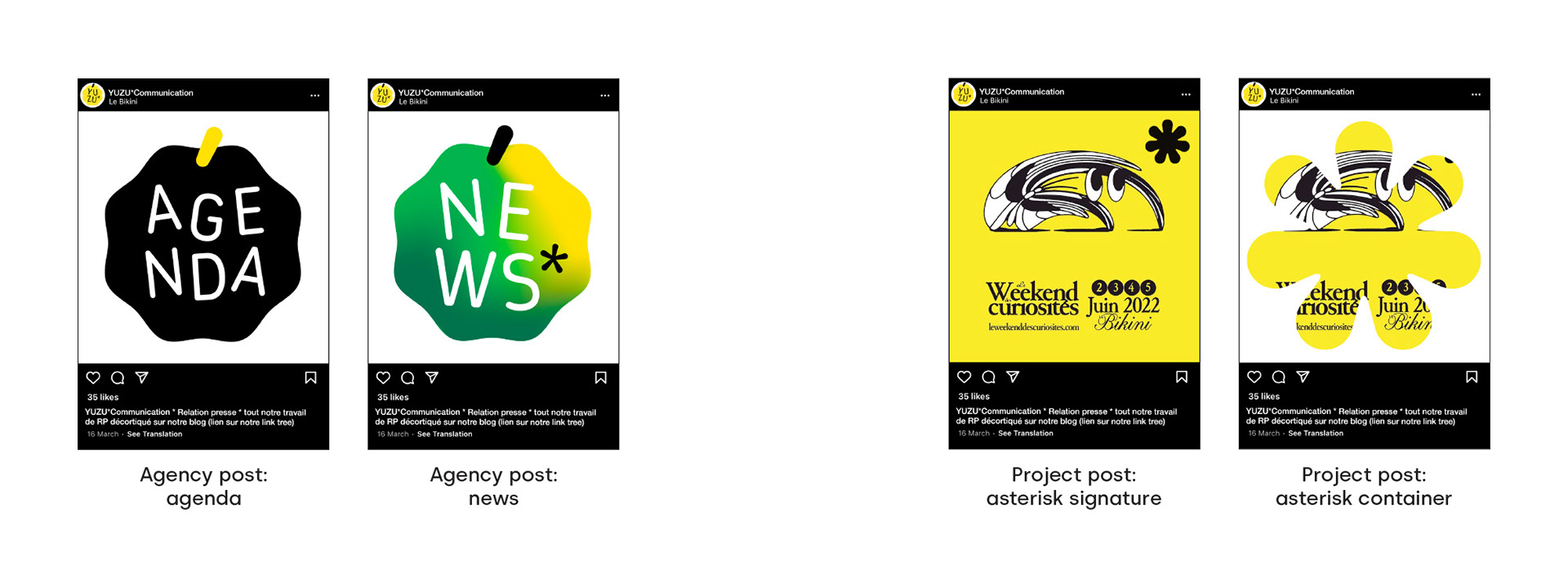
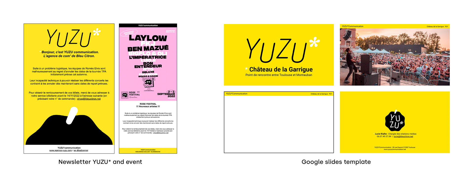
The branding is divided into two branches: one representing the agency and the other representing its projects. The outer appearance of the fruit symbolizes the agency, while the inside—the pulp—represents its work.
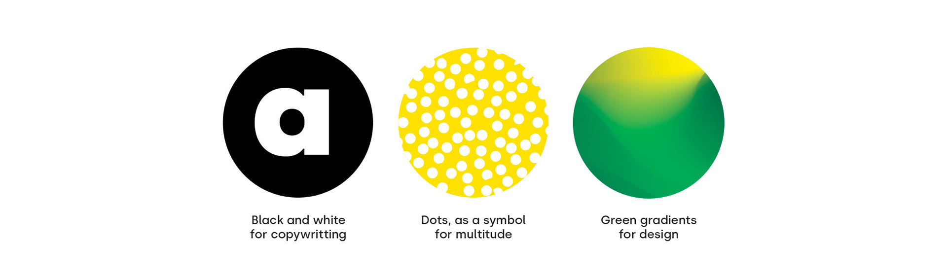
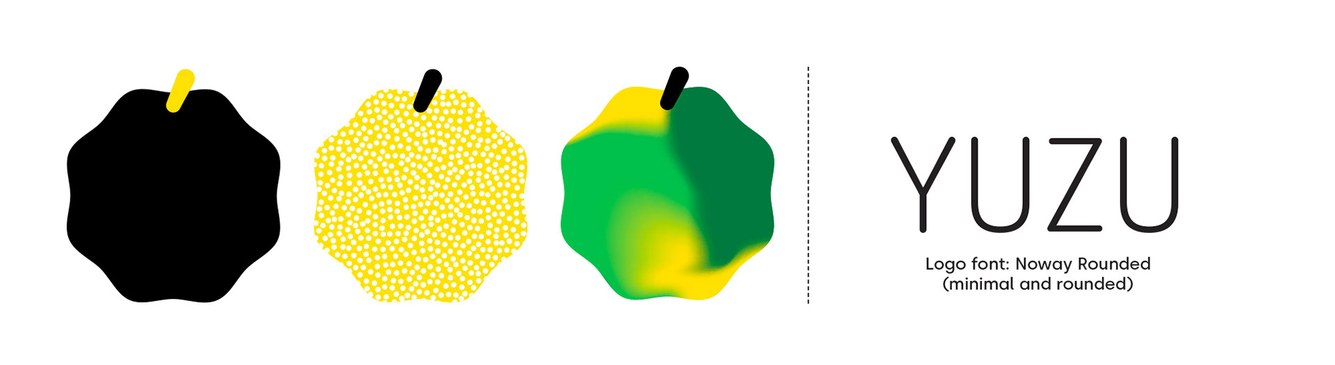
As a communication agency, YUZU offers expertise in copywriting, social media, and graphic design. I created a primary logo in the shape of a yuzu in black and yellow, along with three variations:
• Black and white for copywriting (symbolizing black text on white paper).
• Dots for social media (representing a multitude of interactions).
• Green gradients for design (because, well, it looks good).
The "pulp shape" is used to label or frame images of the agency’s projects. Since it resembles an asterisk, we also use it as such. While I initially aimed to use the same shape for everything, it felt too heavy at smaller sizes, so I designed a simpler, lighter asterisk to complement it.