Chez Dupont
Co-working space
Branding guidelines
Toulouse, 2021
Co-working space
Branding guidelines
Toulouse, 2021
1) About the project
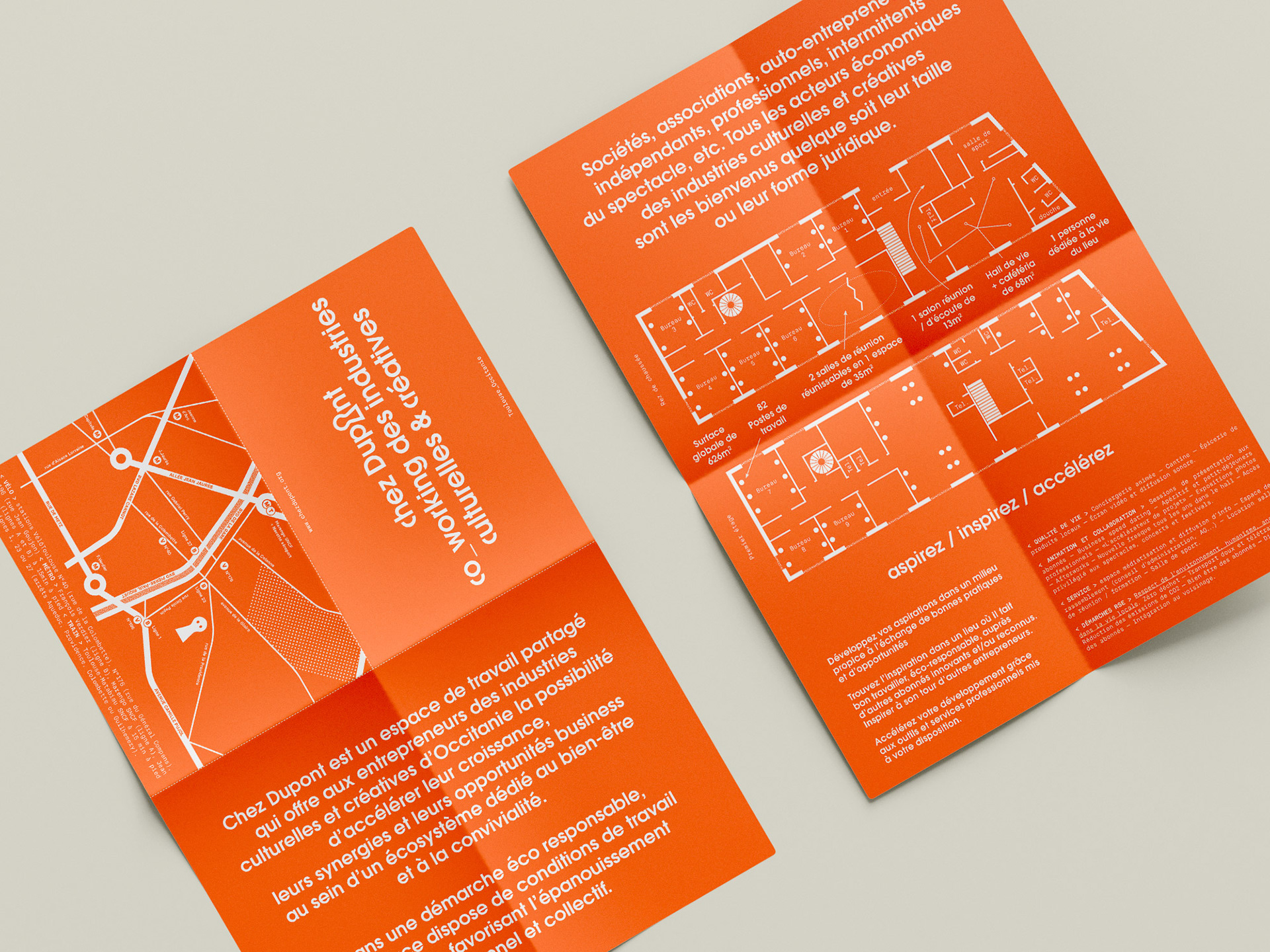
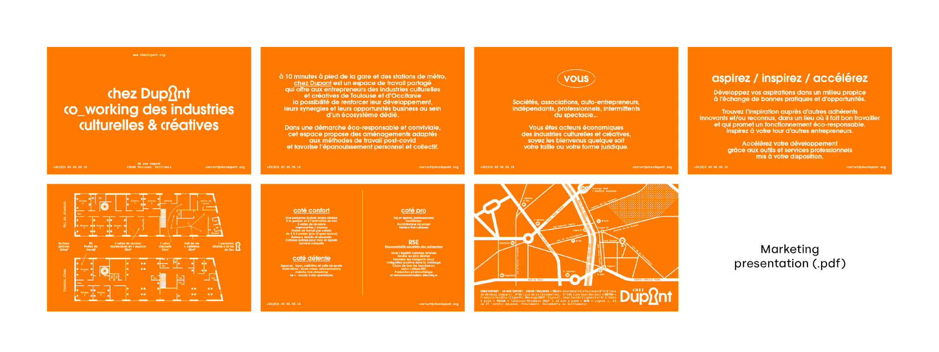
Chez Dupont is a new co-working space in Toulouse, France. I was asked to develop a concept and set up guidelines for an in-house designer to take over. It’s not a strict corporate identity, but it had to be memorable and easy to follow.
2) My approach
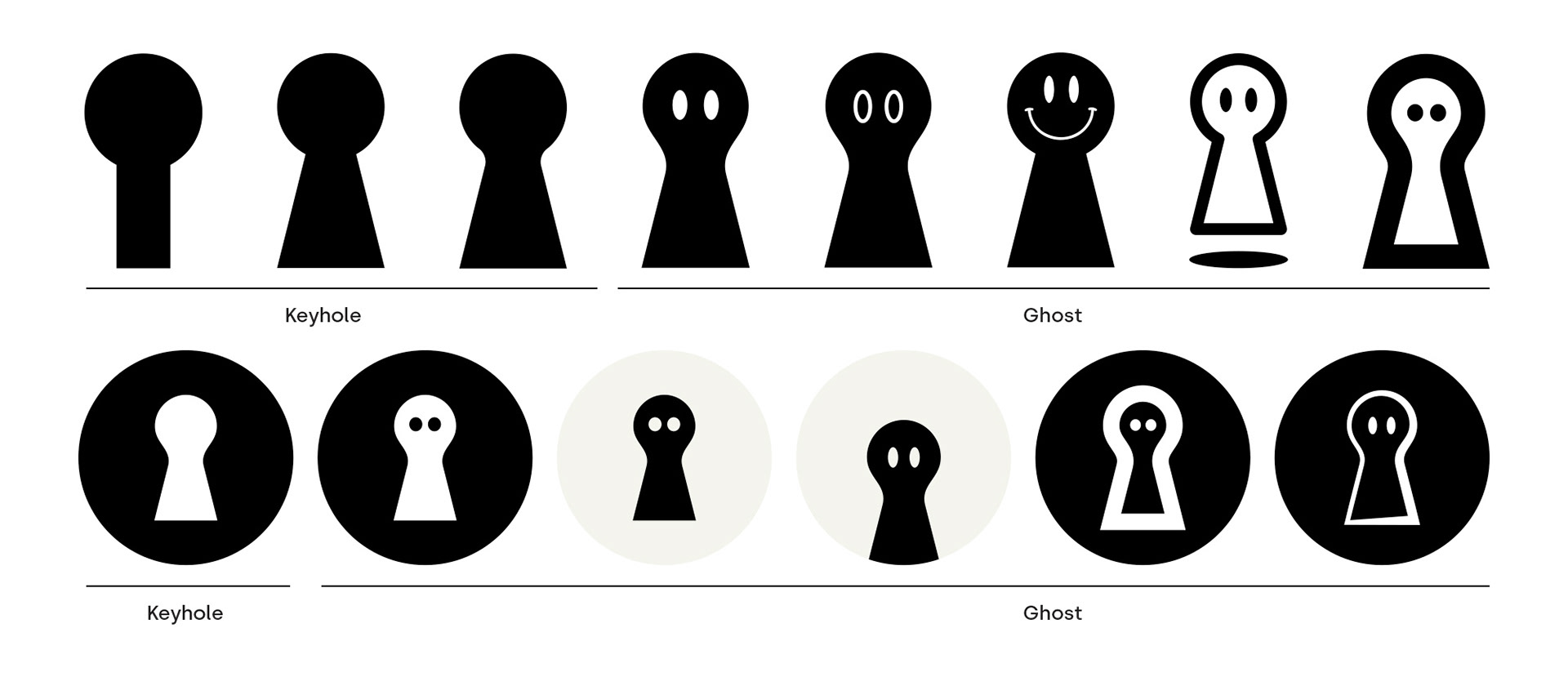
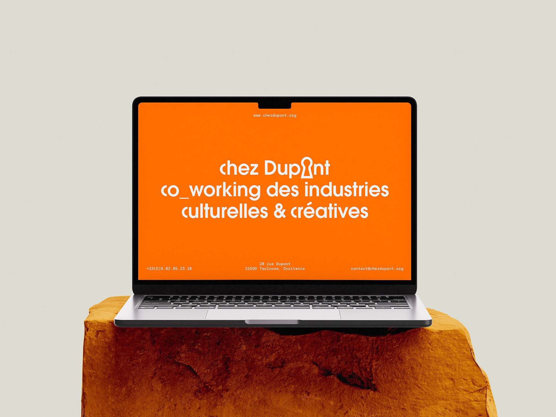
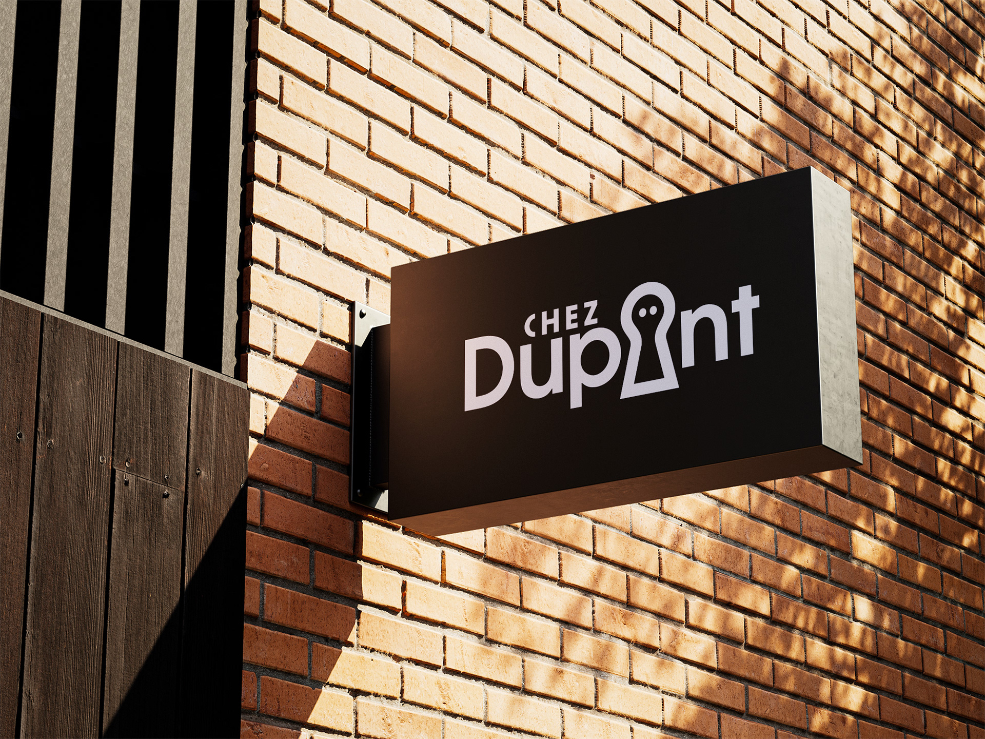
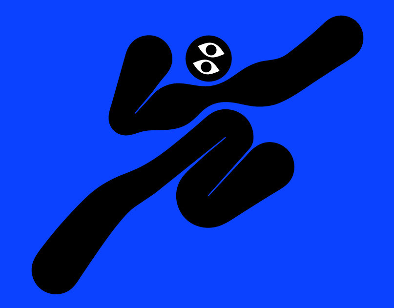
I started by identifying what makes the project unique. The space used to be a tombstone workshop, it’s now a co-working space, and Dupont is a common last name. That’s how I imagined a ghost named Dupont haunting the place at night.
While sketching, I realized the ghost could also resemble a keyhole—perfect for a shared space where members have their own keys. Outlined, it fit neatly as the O in "Dupont" while staying legible. That’s how the day-and-night logo concept came to life.
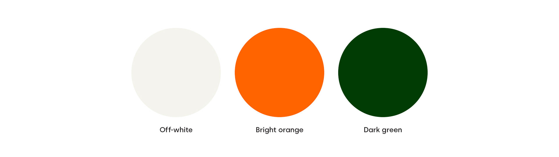
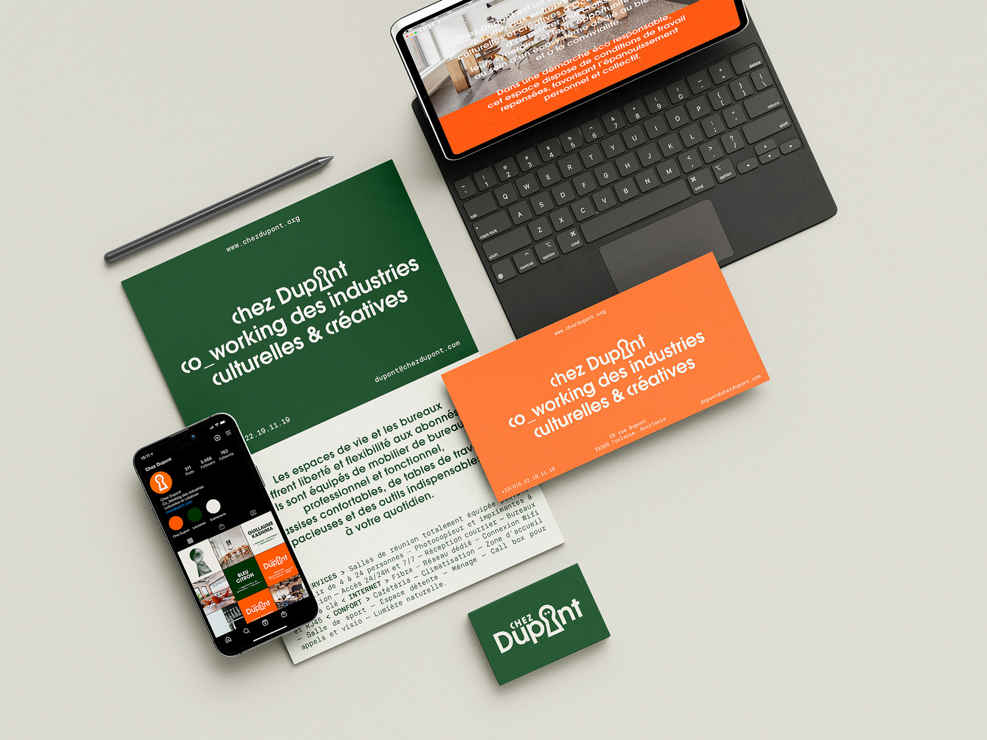
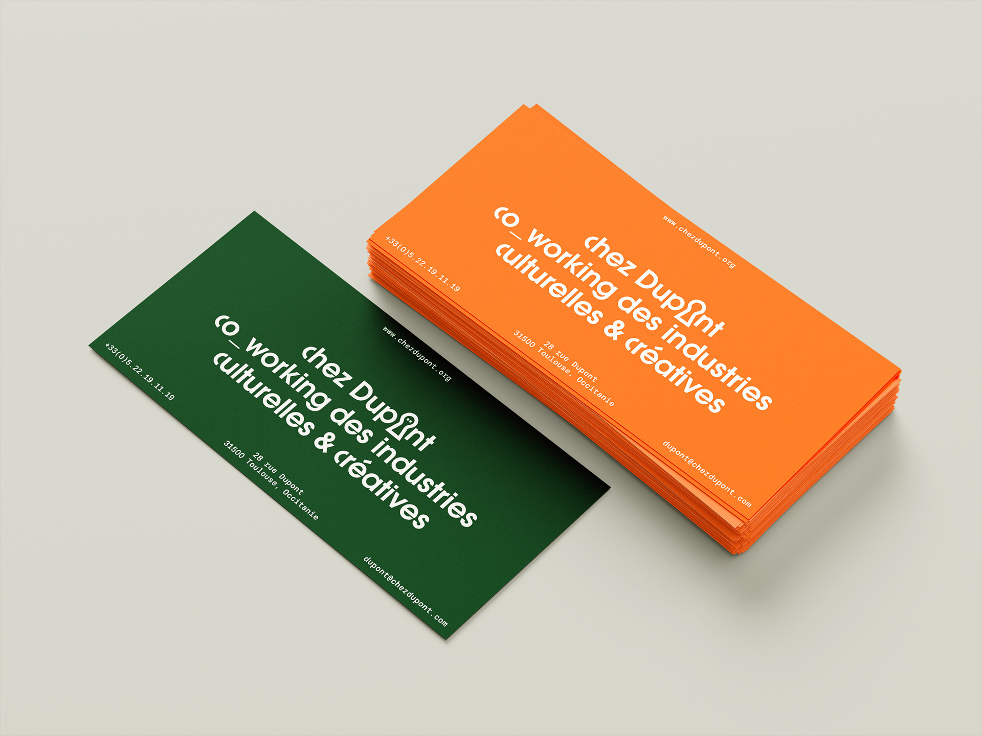
With no photos available, the branding relied on bold color and typography. I picked a bright orange for energy and activity, balanced by a deep green. Avant Garde Gothic added a modular feel, fitting for a co-working space, while a monospaced font reinforced that flexibility.
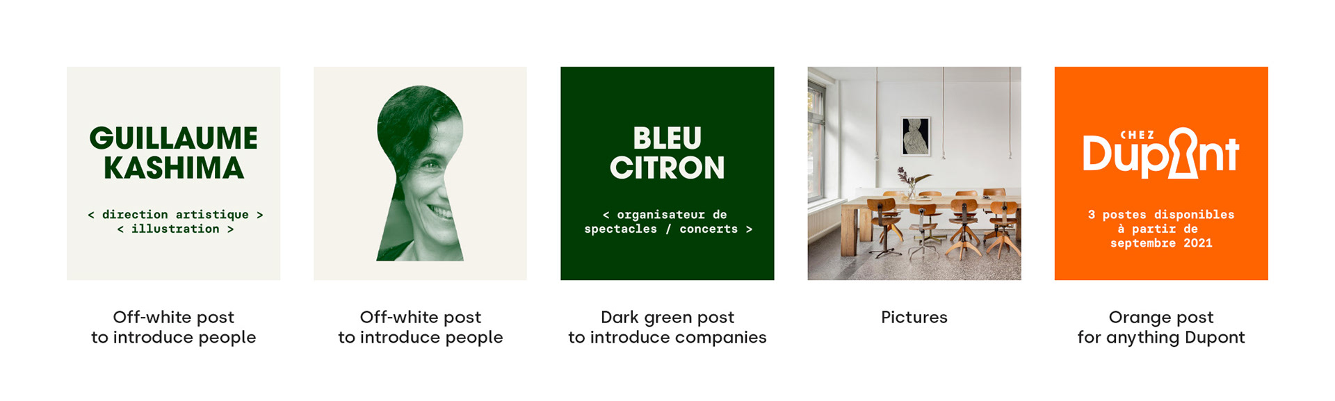
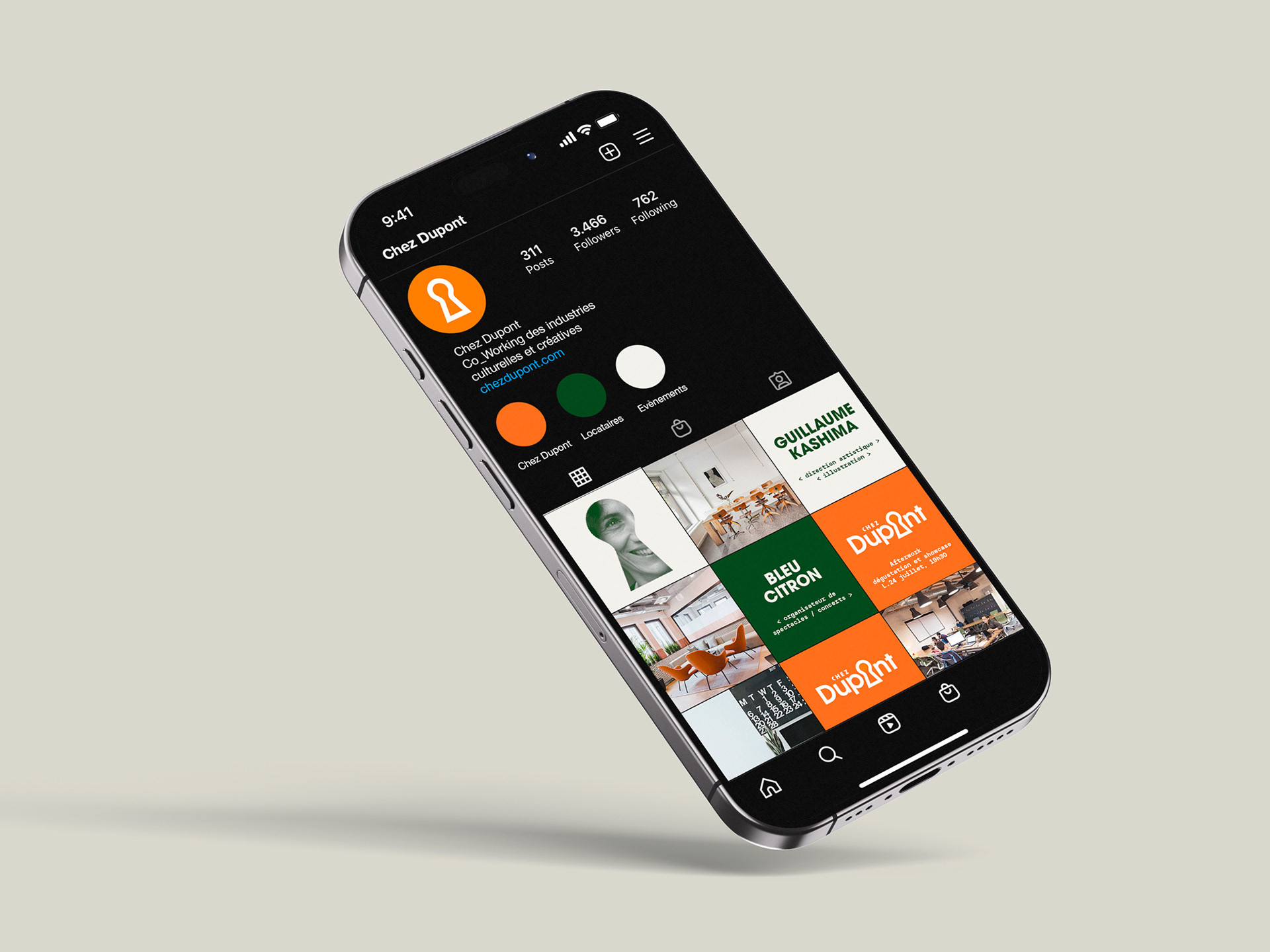
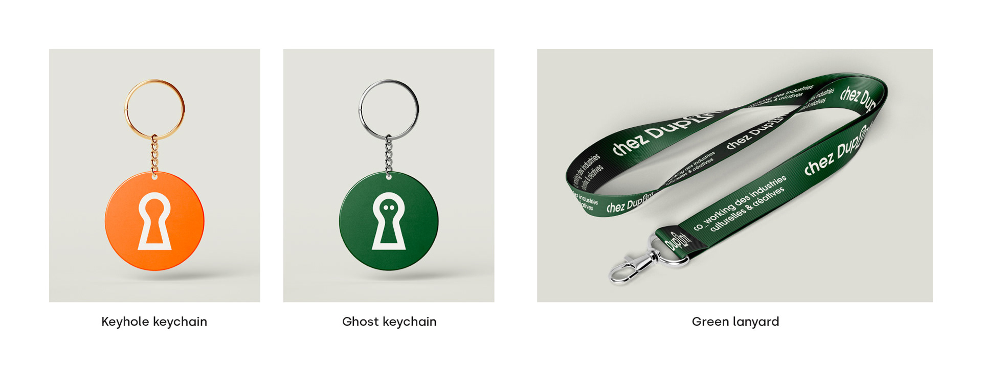
For social media, Chez Dupont uses orange, companies use green, and people are featured on off-white. The keyhole shape can also frame images. Merchandise naturally extends to keychains and lanyards.
Boo.