Bleu Citron
Production company
Branding guidelines
Toulouse, 2021
Production company
Branding guidelines
Toulouse, 2021
1) About the project
Bleu Citron is a production company that organizes concerts and festivals across France. They also manage artists. Fresh out of design school, I worked with them to create posters and programs. Twenty years later, when everything stopped during the pandemic, they took the opportunity to rethink their branding. That’s when they called me.
Most of their work happens behind the scenes. What the public usually sees is just a logo at the bottom of a poster—one that gets passed around and used in ways they can’t always control.
2) My approach
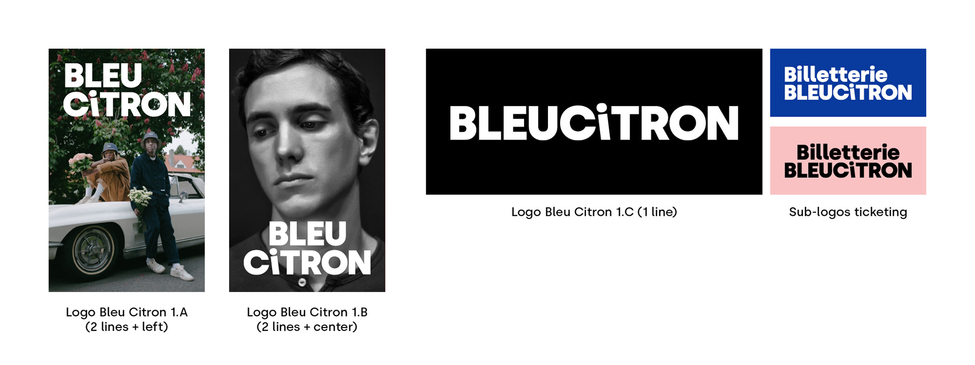
With that in mind, I designed a simple typographic logo: bold, geometric, sans-serif, easy to read. It works on one or two lines, left-aligned or centered, giving designers multiple options. They can’t mess it up. There’s a playful twist on the lowercase "i"—it doubles as an inverted exclamation point or a little character, adding a touch of lightness and fun.
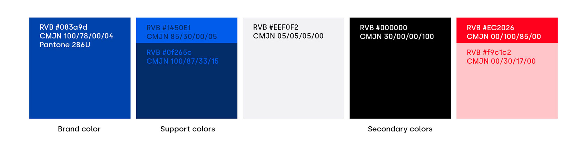
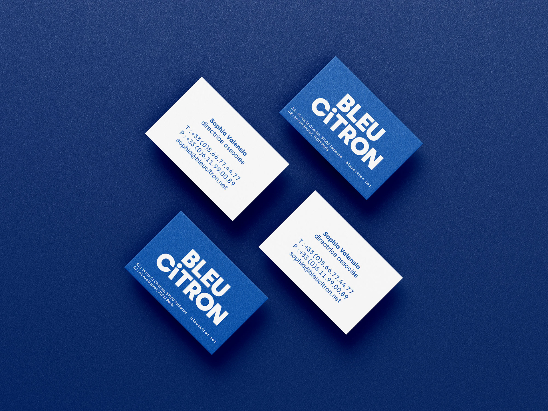
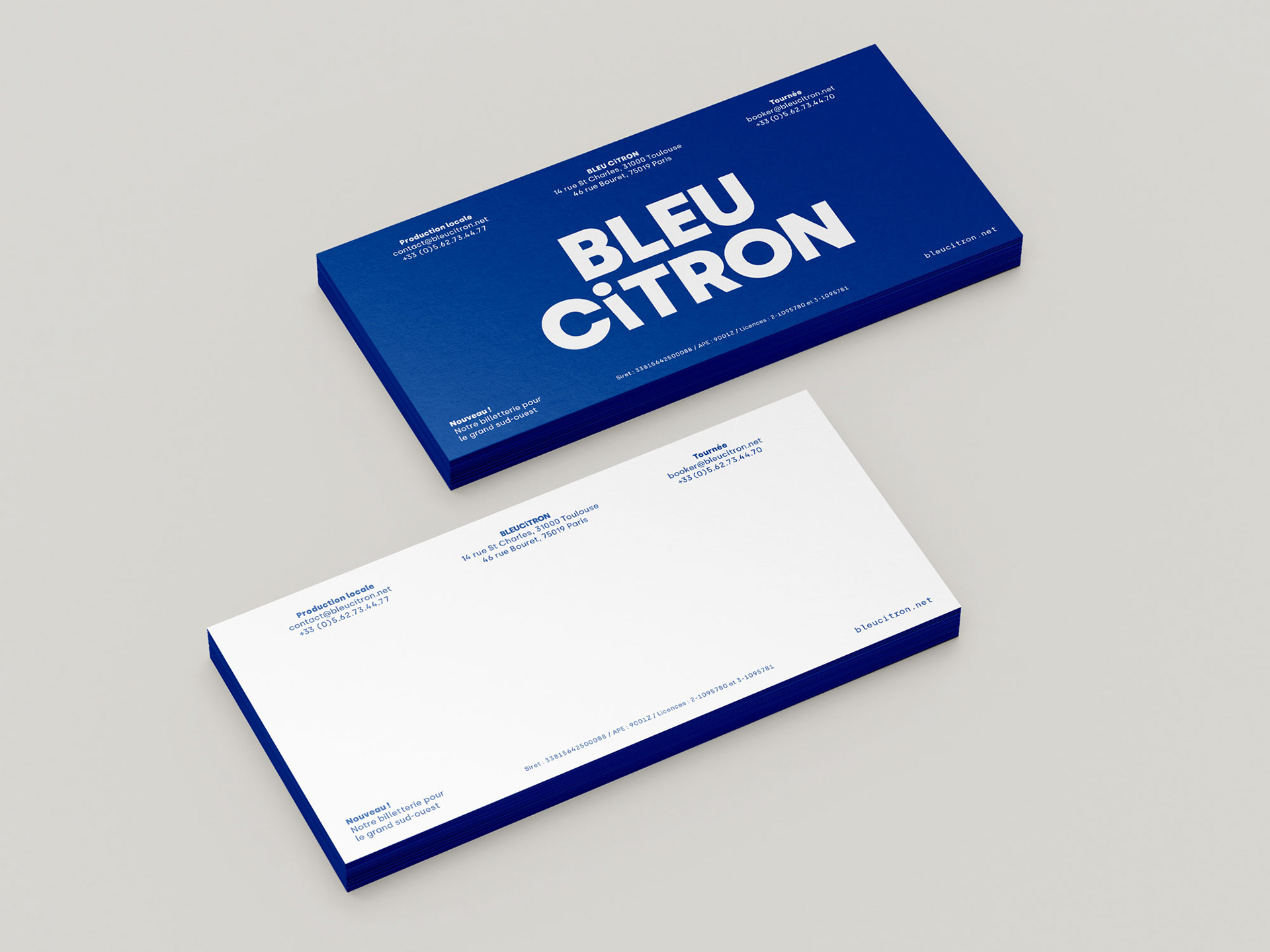
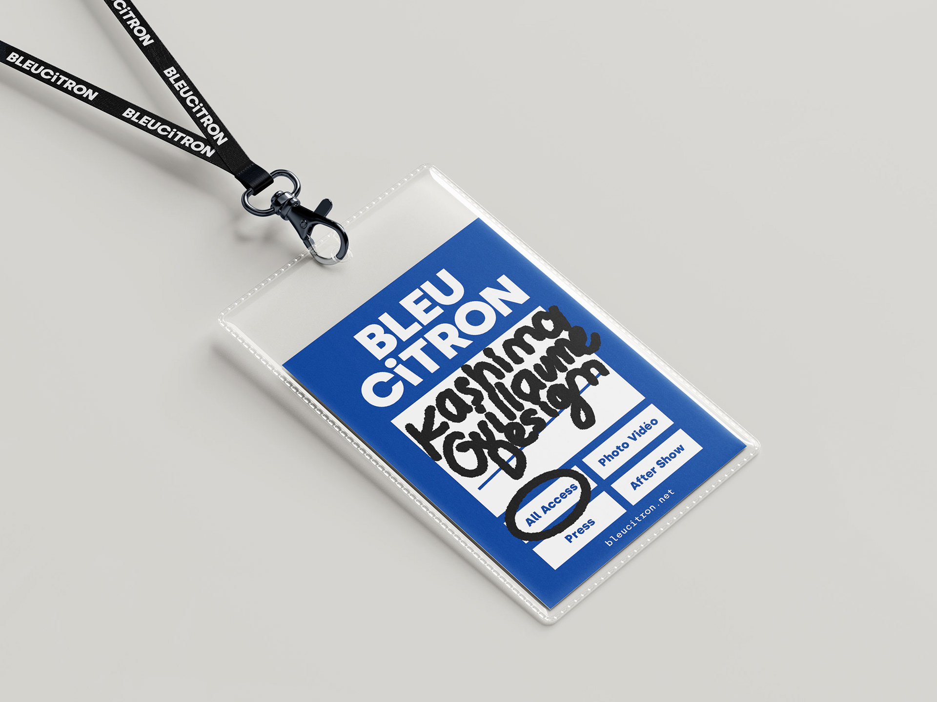
The stationery relies heavily on the logo and color. Since Bleu means blue, I picked the best blue possible in CMYK, as they still print a lot of documents. Design-wise, I kept things simple—again—so anyone, from designers to marketing staff, could create branded materials easily.
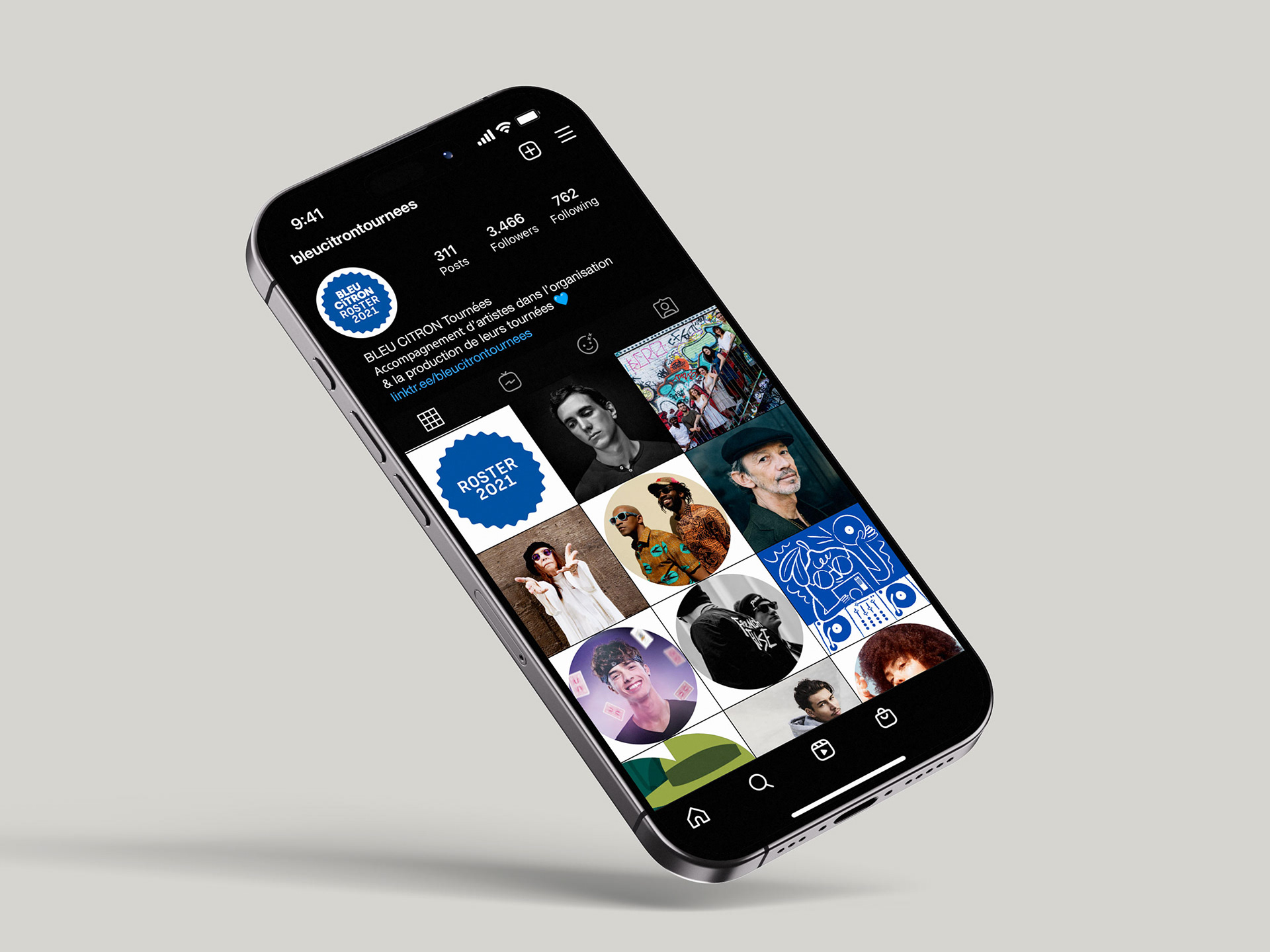
Some items, however, remain designer-only: their annual artist catalog (which is usually a poster) and their social media content. For the poster, I took inspiration from Instagram’s grid, creating a physical format that echoes the digital. The best part? You design once, and it works twice.
I also created a mascot: a cute lemon character with glasses, affectionately named John Lemon. They use it here and there for fun, and in their newsletter when announcing a canceled concert. Because, really—who could be mad at a lemon?